Preprocessing
We will now preprocess our raw data which will reduce noise from non-biological signal as well as filter out low quality cells. Part of the preprocessing stage is also transforming the data such as log-normalizing or scaling data to a given distribution. This will help give more meaningful results and help remove or reduce the effect of outliers.
Exploratory data analysis
In order to better understand our data, we will perform the EDA part of our analysis. This will involve using statistical methods including visualizations to provide a summary of different aspects or characteristics of the data.
Highest expressed genes
First let's see which genes are the most expressed across our dataset:
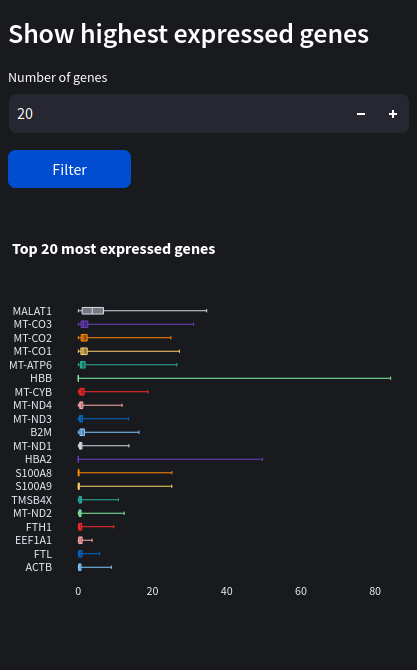
Hover over the box plots to see their median, q1 & q3, lowest and highest counts.
We can see the most expressed gene by far is Malat1 with a median count of around 3.75, followed by some mitochondrial genes (denoted by the ‘MT-‘ prefix).
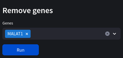
Malat1
Malat1 gene can be a result of unwanted technical noise so can often be removed from the dataset.
Let's remove malat now:
Sample sex
If the sex of the donors is unknown, mislabeled, or we wish to verify the sex from the supplementary materials, we can do this by measuring genes found contained on the sex chromosomes. In this example, we measure the levels of the XIST gene across samples (select the subsample tab). XIST is a non-coding RNA involved in X-inactivation found exclusively in female somatic cells (although can also be found in male germline cells) so will work well for our blood samples. It should be noted that while the coding sequence for XIST is on the X chromosome (so the DNA sequence is present in both males and females), the RNA transcript is not produced in males and therefore won't appear in our dataset. We can see very clearly the sex of each sample:
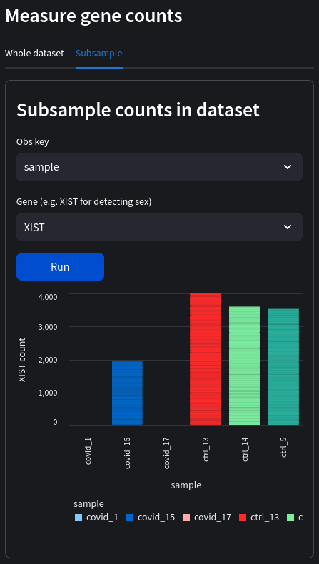
Sex of the donors (note that we don't have any male control groups in this particular dataset):
| Sample | Sex |
|---|---|
| covid_1 | male |
| covid_15 | female |
| covid_17 | male |
| ctr_13 | female |
| ctr_14 | female |
| ctr_5 | female |
Cell cycle states
It would be useful to know which stages of the cell cycle our samples are in, as this leads to potentially unwanted variation between cells. Here's a brief reminder of the cell cycle phases:
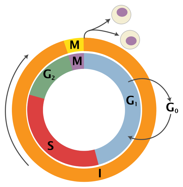
Adapted from Wikipedia (Image License is CC BY-SA 3.0)
- G0: Some cells enter G0 once they are fully differentiated. These would include neuron cells and red blood cells and are permanently arrested in this distinct phase
- G1: Gap 1 phase is the beginning of interphase. No DNA synthesis happens here and includes growth of non-chromosomal components of the cell
- S: Synthesis of DNA through replication of the chromosomes
- G2: The cell enlarges for the preparation of mitosis and the spindle fibres start to form
- M: Mitosis phase is the nuclear division of the cell (consisting of prophase, metaphase, anaphase and telophase).
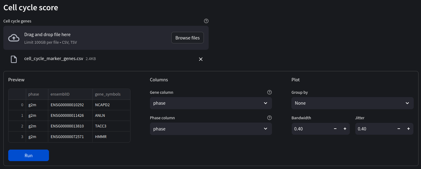
We will be scoring cells on which phase it is likely in using a set of marker genes indicative of that phase. Marker genes act as a type of identity or signature of a particular cell state, type, or some other intracellular process we are interested in. To score a gene list, the algorithm calculates the difference of mean expression of the given list and the mean expression of reference genes. To build the reference, the function randomly chooses a bunch of genes matching the distribution of the expression of the given list.
First we will need the marker gene list
Once our marker genes file has been loaded in, ensure the gene and phase columns correspond to the correct column name and select ‘Sample' as our group by ID.
Make sure the gene format of your imported marker genes is the same as the one in your dataset. In our case we are using the gene names (not ensembl IDs). If your marker genes are in the wrong format, either try to convert them, for example with the biomart API. Alternatively convert the dataset genes using the gene format toggle switch in the sidebar.
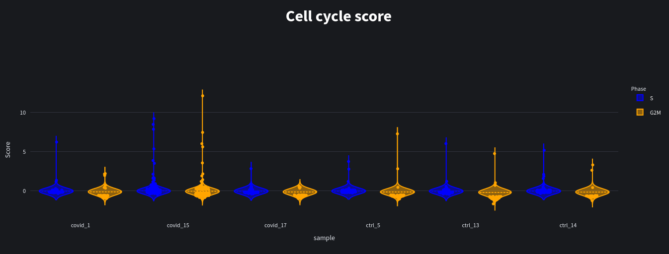
When we run our analysis we see the results as violin plots and scatter plots of the predicted scores:
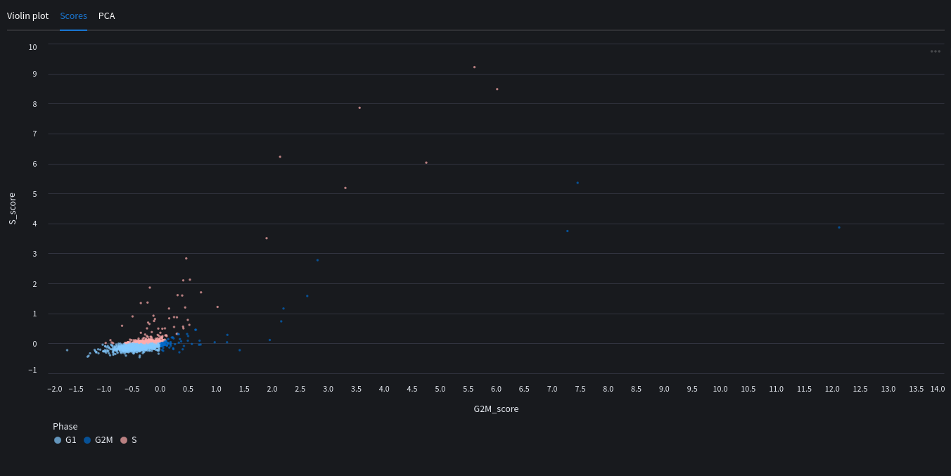
You can also see a PCA map with the highlighted scores.
Quality control
An important part of preprocessing is assessing the quality of our dataset. This means removing low quality cells, or cells which have too low or high counts which may interfere with our analysis.
Annotating mitochondrial genes
A popular and simple method of predicting low quality cells is by looking at the percentage of mitochondrial genes in each cell. A high proportion of mitochondrial genes are indicative of low quality cells (Islam et al. 2014; Ilicic et al. 2016). If cytoplasmic RNA is lost due to perforated cells, this leads to an artificial relative increase in mitochondrial transcripts. Therefore, we will first annotate whether the genes are mitochondrial (denoted by the ‘MT-‘ prefix in gene names) which we can display as scatter or violin plots.
Feature names must be in the correct format for detecting mitochondrial/ribosomal/haemoglobin genes (with the MT-, RB- and HB- prefixes respectively). If gene names are in the ensembl format (e.g. ENSG00000139618) you can convert to gene symbols using the gene format toggle on the sidebar.
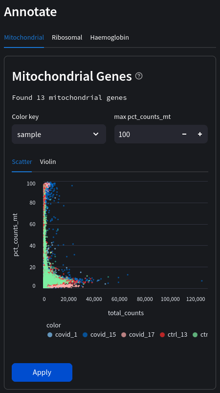
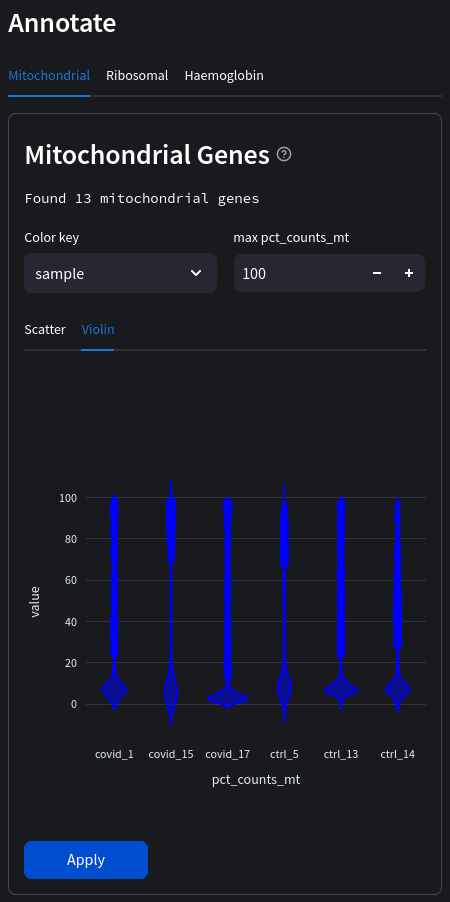
Select a color key to compare observations across the dataset. In the above example we can compare individual samples. If no color key is selected the data will be in aggregate.
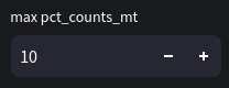
Next, we will remove cells that containing more than 10% mitochondrial genes. This is an example of filtering based on a fixed threshold (since the 10% doesn't take into account the distribution of mitochondrial reads). In the future we will likely implement adaptive thresholds also.
Filtering based on number of genes and cells
Another simple way to filter our data is to only keep cells which contain a minimum number of genes, as well as genes which are expressed in a minimum number of cells. In our case we will only keep:
- cells with at least 200 genes
- genes which appear in at least 3 cells
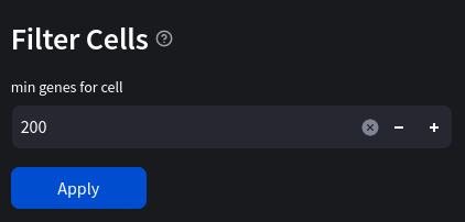
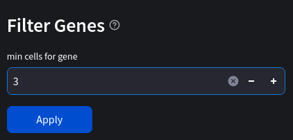
This helps to remove low quality cells which may contain a lower reading of transcripts due to technical error. Cells with a lower number of features are also less useful in analysis, as are genes which only appear only a few times in the dataset. In general we are trying to make our data more meaningful and less prone to containing technical noise leading to false conclusions.
Batch effect correction
Often technical variation arises in experiments which don't reflect biological variation. This could be due to different library preparation techniques, batch reagents, different sequencing platforms and labs doing the analysis. In our case using a dataset with multiple sample batches which introduces batch effect, masking biological signal from our analysis. Let's look at the PCA map (Nuwa automatically selects the batch key as the color):
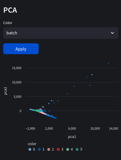
Notice the banding patterns representing our batches? This could lead to misinterpreting clusters since the difference in experimental batches are mistaken for actual biological variation! Our primary method of combating this is using a regression model, often in high dimensional space
Doublet prediction & removal using scrublet
Doublets or multiplets are caused when 2 or more cells take up the same droplet in droplet-based scRNA-seq protocols. This gives the appearance of upregulated genes when in fact it is including RNA counts from 2 different cells. One of the ways Doublets can cause issues is by forming their own clusters when performing dimensionality reduction, which don't reflect any biologically distinct cell population.
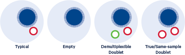
Image from 10x genomics
What is multiplexing?
[from illumina website] Sample multiplexing, also known as multiplex sequencing, allows large numbers of libraries to be pooled and sequenced simultaneously during a single run on Illumina instruments. Sample multiplexing is useful when targeting specific genomic regions or working with smaller genomes. Pooling samples exponentially increases the number of samples analyzed in a single run, without drastically increasing cost or time.
With multiplex sequencing, individual “barcode” sequences are added to each DNA fragment during next-generation sequencing (NGS) library preparation so that each read can be identified and sorted before the final data analysis. These barcodes, or index adapters, can follow one of two major indexing strategies depending on your library prep kit and application.
In a typical 10x experiment the proportion of doublets is linearly dependent on the amount of loaded cells. In our covid dataset, we actually have a subsample (the original contained more groups including an influenza group which we removed). The original dataset contained about 5000 cells per sample, which equates to around 9000 cells loaded in. From the specs in the 10x Chromium user guide (see page 18) we can see that for every ~1000 cells recovered, about 0.8% are estimated to be doublets. So we can predict that ~4% of our library samples will be doublets (0.04 x 5000).
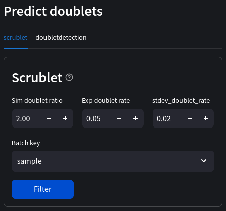
Let's run Scrublet to predict doublets and remove them from our dataset. We'll leave most of the default parameters, but use ‘sample' as our batch key as this will allow us to see the names of each batch.
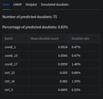
We can compare our doublet rates and mean scores across each batches. Note that the scores are averaged per batch, similarly the doublet percent is not combined across batches.
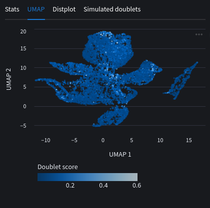
We can look at a UMAP plot with the doublet scores as embeddings. You will usually see cells with high scores around the edges or between clusters. This is the issue discussed before where we can mistake the doublets for distinct cell populations if not careful.
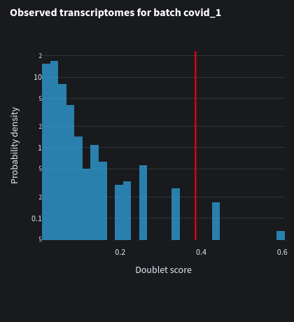
We can also look at the distplot for each batch with their respective doublet scores. Notice how the threshold is slightly different from each batch.
Data transformations
Our data isn't usually in the optimal format for passing directly into our training models, we must transform it into values which reflect mean and variance. This helps ensure than one feature does not dominate another, for example in the case of an outlier. With scaling and normalization techniques we can place data in a similar range without losing the underlying distribution of the data. Transformations such as feature scaling for example also improve a model's performance. Some of the tools we've used already normalized the data under the hood. However we'll give a brief description of scaling and normalization techniques and perform again with known parameters.
Normalization
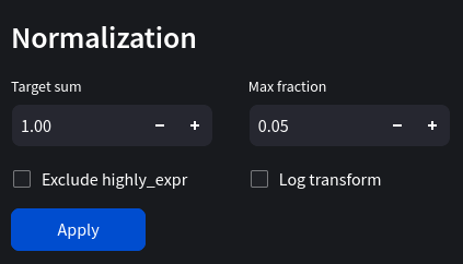
Normalization can refer to a multitude of different transformations in machine learning. Generally it places data in a range of values, for example 0 and 1. Scanpy's normalize_total function transforms data so they add to a target sum. For example, if the target sum was 1, each cell's gene counts would add up to 1. We'll use 1e4 as our target sum, 0.05 as our max fraction and log transform the data.
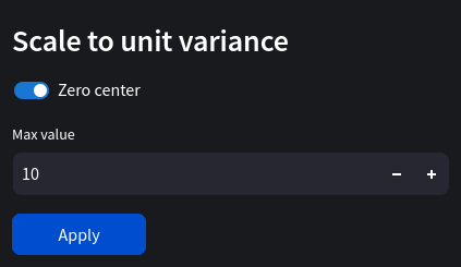
Scaling data
Scaling feature columns typically reduces the range of values for each observation (cell) between 0/-1 and 1, however this is not always the case. We can select a max value to clip gene counts over a certain amount. Let's set max value to 10 and enable zero center. Our features (genes) will now have a zero mean while retaining the same distribution across our cell types.
We can summarize our changes to each column vector x as follows:
\[\lim_{x\to 10} x' = \frac{x_i - μ}{σ}\]We are clipping our data by placing an upper limit on gene expression. This will help in limiting the effect of outliers in our dataset. Scaling to unit variance will also yield better performance for our deep learning optimizer in the gradient descent algorithm.