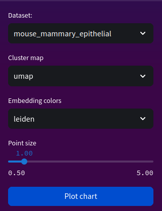
plot chart
Render plotly chart from given embeddings.
Parameters
dataset: str The dataset for analysis.
cluster_map: str The algorithm or obsm name containing coordinates. Currently does not support tSNE for 3D plotting.
color: str The colour for clusters.
point_size: float Adjustable point size for scatter chart.
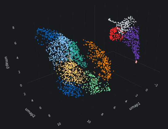
Web view
Python equivalent
import scanpy as sc
import plotly.express as px

# compute neighbourhood cluster embeddings with leiden
sc.pp.neighbors(adata)
sc.tl.leiden(adata)
sc.tl.umap(adata, n_components=3)

# create dataframe
color = 'cell_type'
df = pd.DataFrame({'umap1': adata.obsm['X_UMAP'][:, 0], 'umap2': adata.obsm['X_UMAP'][:, 1], 'UMAP3': adata.obsm['X_UMAP'][:, 2], 'color': adata.obs[color]})

# plot chart
fig = px.scatter_3d(df, x=df.columns[0], y=df.columns[1], z=df.columns[2], color=df.columns[3], width=2000, height=900)
fig.update_traces(marker_size=1.0)
fig.update_layout(title=dict(text=f"{df.columns[0][:-1]} clusters with {df.columns[3]}", font=dict(size=50), automargin=True, yref='paper'))
fig.update_layout(legend= {'itemsizing': 'constant'})
fig.show()