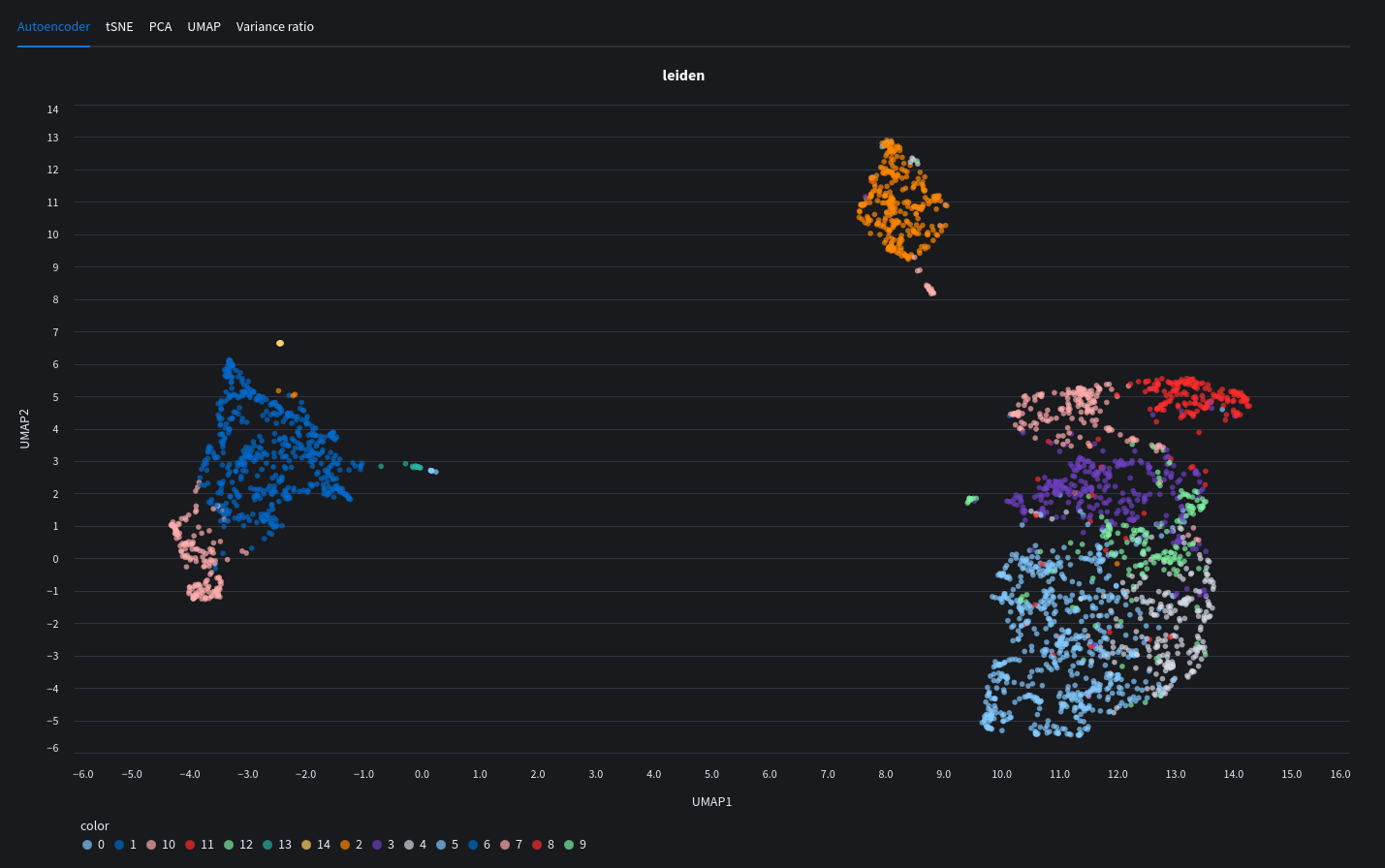
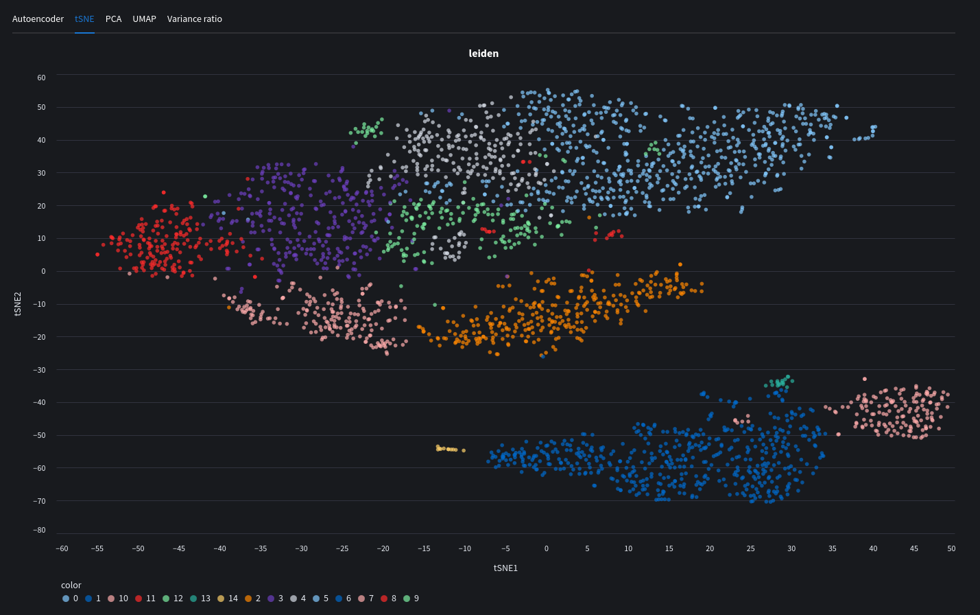
Cluster plots
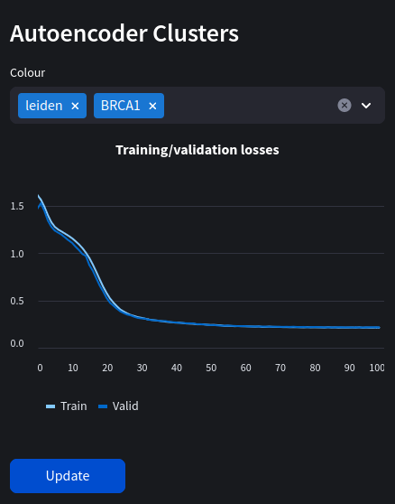
We can now go ahead and visualise our data in plots. If you trained a model in the previous chapter, your results will show up here. The learned embeddings will be added to your datasets which will allow you to see clusters representing cell types or other individual gene expression within the sample. We can also use other dimensionality reduction algorithms popular in machine leanring.
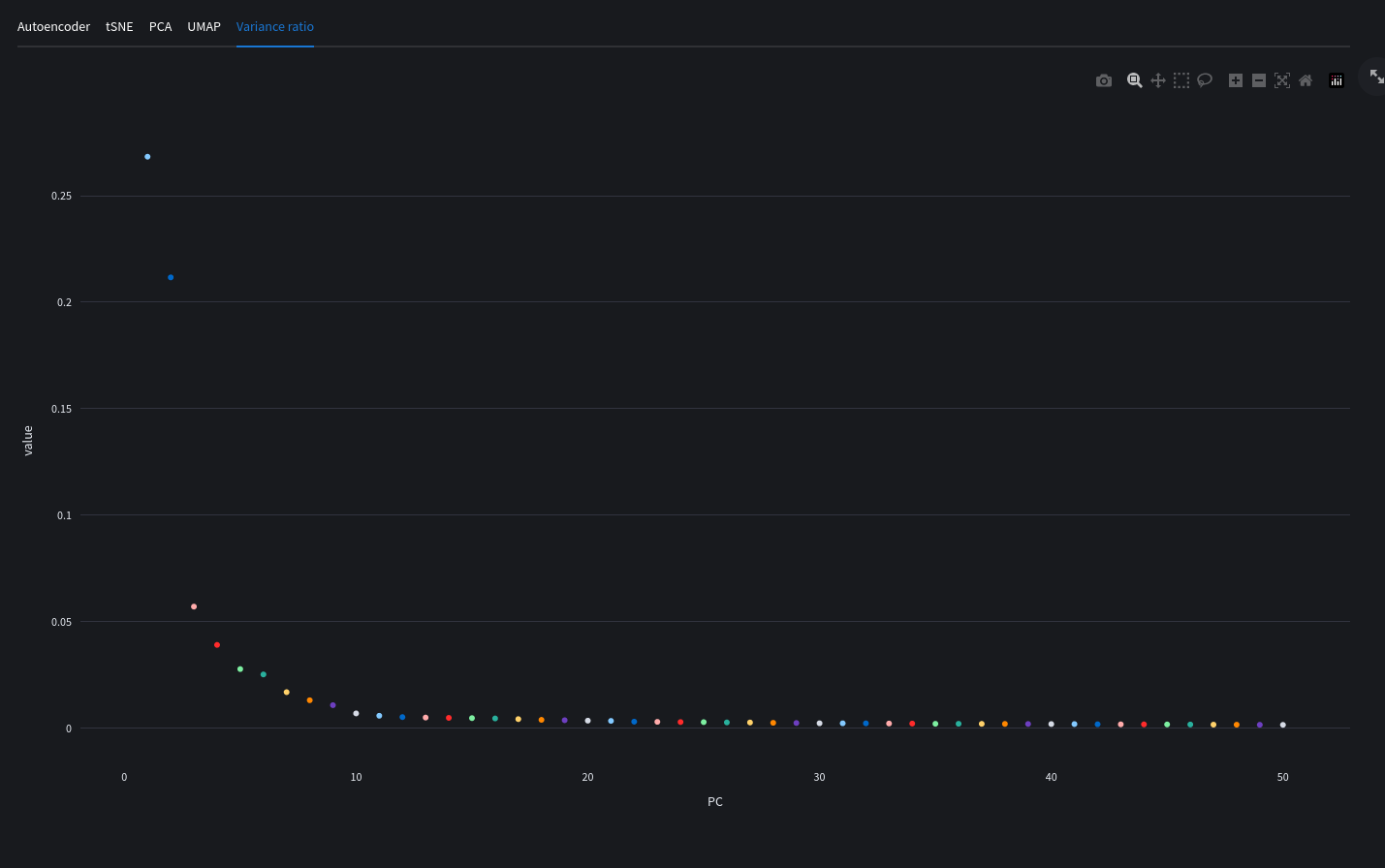
What is dimensionality reduction?
Dimensionality reduction is the transformation of data from a high-dimensional space into a low-dimensional space so that the low-dimensional representation retains some meaningful properties of the original data. In our case we have many variables (genes) which cannot be meaningfully plotting into a chart. We can reduce the thousands of dimensions into 2 or 3 to be represented by our graph axis.
Autoencoder plots
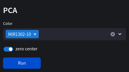
PCA plot
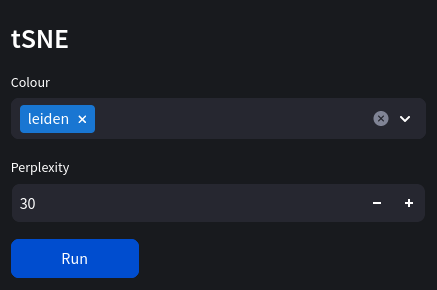
tSNE plot
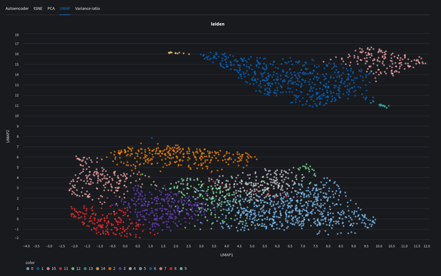
UMAP plot
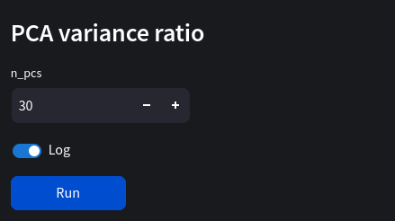
PCA variance elbo plot